




Team
6 members

Timeline
6 months

Country
NDA

Industry
Communication, IT, Gov Tech
About Project
Who was your client
A confidential enterprise client building an internal communications system for government-sector organizations. A long-term Synterra partner — this is one of several projects delivered together.
End users: a cross-section of the organization, from entry-level staff to senior leadership.
We worked closely with the client's team — designers, developers, business analysts, and product owners.
What was the client's request for collaboration
The client already had a meeting/video conferencing module inside their product suite, but it had fallen behind — both functionally and visually. They came to Synterra with a clear ask: redesign the platform to match the company's design system, shared across their full product line, and introduce AI capabilities the product didn't have at all.
What the client brought to the table:
- An existing, working — but outdated — meeting platform
- A Business Analyst who translated user stories, stakeholder feedback, and support patterns into requirements
- A product lead who tracked implementation and delivery
- A development team on standby — supporting and reviewing/accepting incoming code
- An existing design system
Synterra's scope: full UX/UI redesign, frontend implementation, and backend work for meeting search and filtering — delivered end to end by a cross-functional team.
What is the client's bigger business goal
The client builds this software ecosystem on commission for government-sector organizations, as one consistent product line. The meetings module needed to hold its own against established market leaders while staying consistent with the rest of the suite — and meeting the reliability and compliance standards the government sector expects.
At what stage was the client's project
What existed:
- An existing meeting platform, already built but outdated
What wasn't working:
- Hosts, participants, and pending users all saw nearly the same interface — no role separation
- Host tools were thin: no bulk actions, weak audience management, no moderation tools for Q&A — running a real webinar at scale wasn't realistic
- The interface ignored the company's design system, clashing with the mail/calendar tools the same users already knew
- No adaptation for smaller screens — managing a meeting from a tablet or mobile phone didn't really work
- Zero AI capability anywhere in the product
What was the expected outcome of the contract
- A role-based experience — hosts get bulk participant management, permission controls, and meeting lock/unlock; participants get a simplified, distraction-free view with the option to request elevated permissions
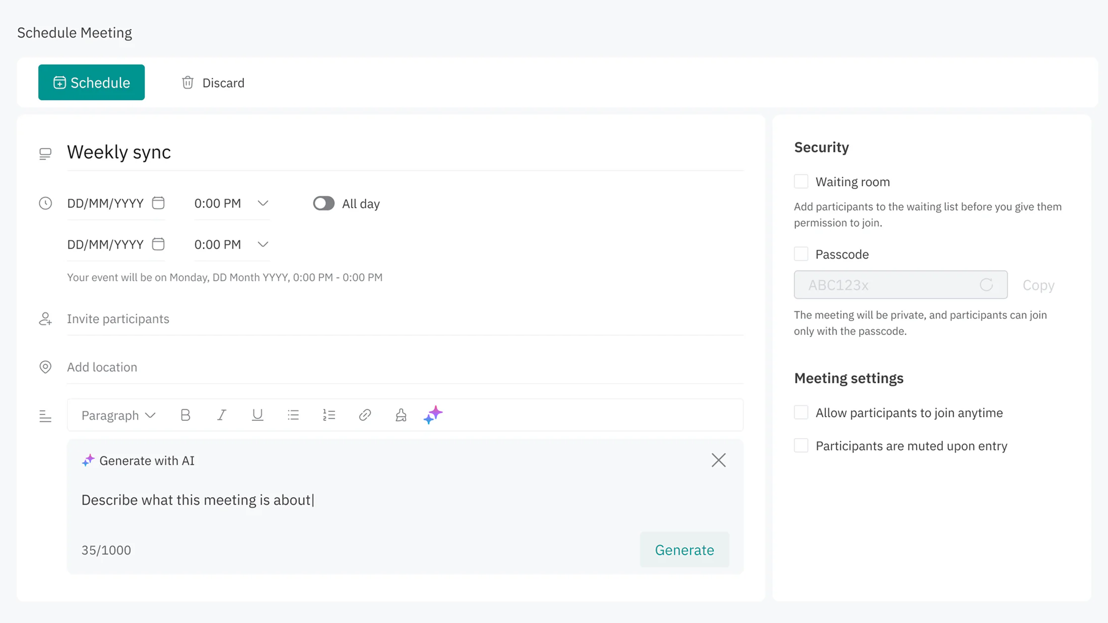
- AI help built into the moments that need it: a conversational assistant, scheduling-conflict alerts, auto-generated meeting summaries, late-join catch-up, and inline scheduling assistance
- An interface consistent with the other internal tools used daily, with new UI patterns documented in the shared component library for future modules
- A platform that works on tablets and mobile screens
- One system that scales from a 3-person sync to a large webinar
- Fast, reliable search and filtering across large meeting datasets
How the result was measured
Direct user interviews and analytics weren't available during the design and build phase, due to access limitations.
To de-risk decisions without that access, the team leaned on:
- Competitive analysis of leading meeting platforms — meeting controls, webinar modes, responsive patterns, and how each handles AI
- Close work with the client's Business Analyst, translating existing user stories, stakeholder feedback, and support history into concrete design requirements
- A legacy audit of the existing interface to pin down exactly where it broke down and where it conflicted with the design system
- Cross-functional trade-off sessions weighing consumer-tool simplicity against enterprise requirements like bulk actions, permissions, and compliance
Before handoff, stakeholders and the product team reviewed and signed off on the design direction, confirming it balanced enterprise depth with consumer-grade ease of use. Usability testing and adoption metrics were planned for after rollout.
How the collaboration went
Duration: 6 months.
Synterra side: a cross-functional team — UX/UI design, frontend development, and backend development — carrying the project from research through to a production-ready build.
Client side: designers, developers, business analysts, and product owners, working alongside us throughout the project.
How it worked day to day:
- A feature was designed in high-fidelity, then sent for review
- Feedback came back, revisions were made
- Once approved, the feature moved into development — reviewed by the client's development team — while the next feature was already being designed
Design and development ran as a pipeline: as soon as one feature was approved, it moved into development while the next feature entered design.
Challenges
1. Designing without direct user access
Challenge: No interviews or analytics were available, due to access limitations.
Solution: Built a constraint-driven research process instead — competitive benchmarking, Business-Analyst-translated stakeholder input, and a full legacy-interface audit — to de-risk decisions without direct user testing.
2. Figuring out where AI should live
Challenge: No AI assistant existed yet, and we needed to find the best way to introduce one — a chat-only assistant would miss chances to prevent problems before they happen (scheduling conflicts, missing breaks), while a fully proactive, notification-driven one would take away user control.
Solution: Ran a discovery phase comparing both approaches, then designed three integration points working together instead: an on-demand conversational assistant, proactive contextual alerts, and inline assistance built into the scheduling flow.
3. Gaps in the design system
Challenge: Components the product actually needed — webinar control bars, AI cards, mode switchers — didn't exist yet in the client's design system.
Solution: Rejected both fully custom components (breaks consistency) and forcing the wrong existing components into new contexts (kills usability) — instead built new patterns from existing design system atoms and documented them for reuse.
4. Backend performance at scale
Challenge: Search and filtering had to stay fast across large meeting datasets.
Solution: Built efficient data retrieval and filtering on the backend (Node.js, Express.js, Prisma) so the UI never felt sluggish, even with a high volume of meetings.
5. Working in a pipeline, not in isolation
Challenge: With one feature moving into development while the next was already being designed, an early misstep in design could mean reworking code already built on top of it.
Solution: Worked broad-to-narrow — mapped out all features and wrote user stories for the full set first to keep the big picture in view, then focused on individual features one at a time without losing sight of how they'd fit together.
Achievements
What we did beyond just work
No AI requirements existed at all going in — on the business side, there was only a feature name. Instead of waiting on approval and written requirements, we analyzed the possible approaches ourselves and proposed our own solution, backed by research. The solution was approved and carried through into the design.
What was the result of our collaboration
BEFORE:
- One identical interface for hosts, participants, and pending users
- No bulk host controls, weak audience and moderation tools
- No AI capability anywhere in the product
- Broken responsive experience — no adaptation for mobile screens
- Interface inconsistent with the rest of the client's product ecosystem
AFTER:
- Role-based UI: hosts get bulk participant management and permission controls; participants get a simplified, distraction-free experience with the option to request elevated access
- AI solutions designed across multiple touchpoints in the product
- A genuinely responsive platform — properly adapted for tablets and mobile screens, not just scaled down
- Differentiated meeting modes — team syncs vs. large webinars — each with controls tuned to the job
- Fast meeting search and filtering at scale, with editing and duplication for past meetings
- Design system alignment across the product, with new components documented in the shared library for future modules
- Design direction reviewed and signed off by stakeholders and the product team ahead of handoff
For transparency: rollout to end users — and any resulting adoption or usability numbers — wasn't confirmed at the time of writing. Usability testing and metrics were planned for the post-launch phase.
Tech Stack

Next.JS

Typescript

Tailwind

i18n

Formik

Tanstack Table

Node.js

Express.js

Prisma

Figma
Flow
Initial briefing
Received a feature list and business goals — no detailed requirements yet. We ran a discovery phase to fill the gaps: analyzed existing platform pain points, studied competitor approaches, and defined what needed to be built and why.
Design
Ran a discovery phase for each feature, created high-fidelity designs, and aligned with the Business Analyst until approved.
Engineering
Approved design handed off to the development team, who built and integrated each feature into the platform.
Testing
Each feature reviewed and accepted by the client's development team. Feature delivered. The team moved to the next scope of work and steps 02–04 repeated.
Team

1 Designers

1 Project Manager

2 Front end

1 Back end

1 QA


